

Comparison of Various Self‑Hosted and Open AI Image‑Generation Models

Julien Altmeyer
7 minutes read |


This title is a bit misleading (otherwise it would have been too long), so I’ll need to clarify two or three points before getting into the promised comparison…
At LMDDC I’m fortunate to have good equipment for testing different things that could be useful to us internally or for the projects that we are leading.
Another major advantage is that, as we know data sovereignty isn’t just about "where" the data physically resides (hello, France) but also about "who" can access it and, most importantly, who controls and exploits the code that uses that data, I have access to fairly powerful servers and graphic cards (GPU).
All these tests are therefore carried out on‑site, on our own hardware, running Debianoperating systems that I installed myself.
The GPU used for the tests is an L40S card with 48 GB of video memory.
That covers the “self‑hosted” part of the title. We still need to define “AI models” and “Open.”
The models compared here all come from Black Forest Labs; they are all FLUX models, but they differ in their parameter configurations.
Finally, to wrap up this overly long introduction, I used “Open” rather than “Open Source” in the title because some of the FLUX models (schnell and klein) are truly open source—the weights are publicly available and usage freedom is granted under the Apache 2.0 license—whereas others are only “Open Weight,” meaning the weights are provided but their use is restricted by the FLUX.1 [dev] Non-Commercial License.
TL;DR
Four FLUX variants therefore competed against each other on an L40S GPU for image generation from user‑written prompts (text‑to‑image or T2I):
flux-1-dev— the reference model, running at full BF16 precisionmerged-fp8— a dev + schnell blend quantized to FP8merged-fp8-4step— the same blend, distilled to run in four stepsschnell-fp8— the officially “fast” version, also in FP8
We challenged them with three deliberately difficult tasks, each requiring French text to be embedded in the image: a logo, a movie poster, and a trade‑show sign. The goal was to see which model would still hold up when asked not only to produce a beautiful picture but also to write the text correctly inside it.
Le verdict tient en une phrase : dès qu'il faut écrire du texte lisible dans l'image, flux-1-dev at full precision outperforms the FP8‑quantized variants. The “fast” versions produce decent pictures… until you actually try to read what’s written on them!
A word on precision and the number of steps
flux-1-devis a “full‑precision” model (FP16 – 16 bits). This tells us how the numbers used by the model are stored in memory. Basically, it represents the maximum quality setting, but it also consumes the most memory and is the slowest to run.fp8(8 bits) is a quantized version. Each weight is compressed to 8 bits instead of 16. This results in roughly half the memory consommation and faster inference, with only a slight loss of quality in most cases.-4stepis a distilled model and refers to the number of diffusion steps the model performs to generate an image. The standard FLUX‑dev makes 20 – 50 steps per image, whereas the 4‑step models perform only 4, making them theoretically 5 to 10 times faster.
Test Protocol
Three T2I (text‑to‑image) scenarios, each with an increasingly difficult text requirement.
For each scenario we used two prompt styles:
- Short prompt – written as a user would type into a chatbot.
- Long prompt – containing detailed composition and framing specifications.
All prompts written in English (FLUX is primarily trained on English data), but the text that has to appear inside the generated image is in French, which constitutes the hardest test for a diffusion model.
- 28 steps for
flux-1-devetmerged-fp8, 4 steps for the distilled versions (merged-fp8-4step,schnell-fp8). - Notation /5
First Trial: the LMDDC logo
Using an identical prompt for each of them, we ask our models to generate a new logo for LMDDC.
Short prompt:
Create a modern logo for a public organization named "LMDDC" that promotes open-source and digital sovereignty in Luxembourg.
Long prompt:
Professional vector logo for "LMDDC" (Luxembourg Media & Digital Design Centre), a public-interest organization promoting open-source, open standards and digital sovereignty for the Luxembourg public sector. The letters "LMDDC" prominently displayed in a clean modern geometric sans-serif typeface, paired with a minimalist abstract geometric icon based on a stylized triangle (suggesting openness, three pillars, connection). Strictly two-color palette: deep navy blue and white only. Flat vector design, no shadows, no gradients, perfectly balanced centered composition, plain white background, high resolution, professional civic identity aesthetic.
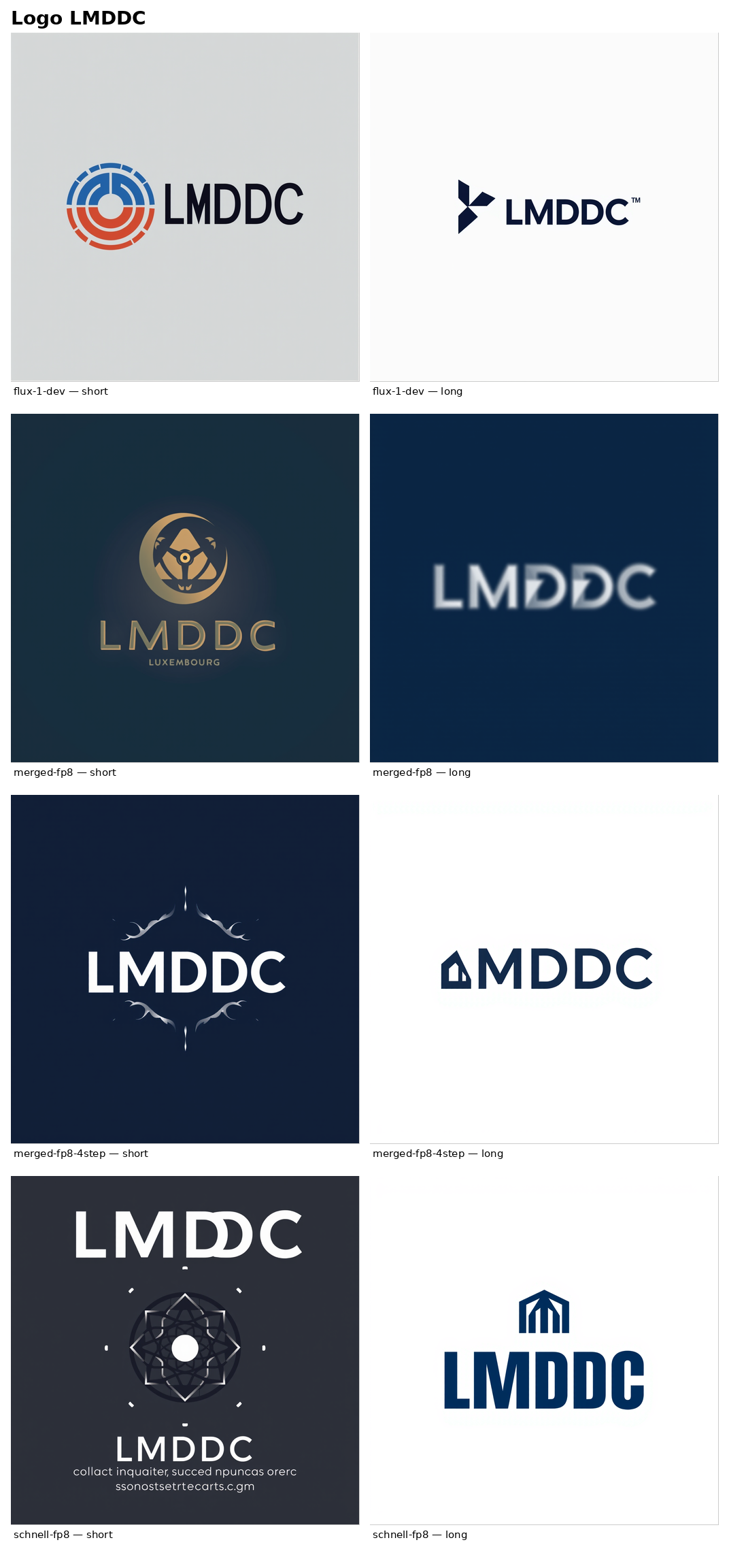
Overall rating: 2.5/5
Winner : Very hard to say because it’s quite subjective. I personnally prefer the schnell model in fp8 despite its wording errors. I think it produced the coolest illustration. It clearly cannot compete with proprietary AIs like Midjourney, but this technology can definitely be helpful for quickly prototyping a few logos while retaining full control over your data. Short prompts yield better results than long ones. As a matter of fact, the longer prompts constrain the model too much and reduce visual variety. For a logo, it’s better to let the model be imaginative.
Second Trial: the LMDDC booth at a tech convention
A wide‑angle scene: LMDDC has a booth at a professional expo like NEXUS 2050 or CES Las Vegas. What would it look like?
Short prompt:
Create a photo of a futuristic "LMDDC" booth at the CES Las Vegas trade show, with a tech atmosphere featuring screens and cyan lighting.
Long prompt:
Wide-angle photograph of a futuristic technology trade show booth at CES Las Vegas. A massive backlit banner spans across the top of the booth, prominently displaying "LMDDC" in clean modern sans-serif white letters on a deep navy blue background, with a small abstract geometric triangle icon placed just to the left of the letters. The booth has a sci-fi minimalist design: matte black floor, glossy white modular walls, vertical glowing cyan LED light strips at the corners, three large floor-to-ceiling interactive touchscreens displaying technical dashboards and data visualizations, a sleek floating black demo table with small futuristic devices and a holographic display projection. Several visitors gather around, watching demonstrations. Background: blurred busy CES Las Vegas convention floor with the CES logo signage faintly visible in the distance. Professional event photography, ultra-wide lens, high dynamic range, cool color temperature with strong cyan and blue LED accents, sci-fi convention aesthetic.
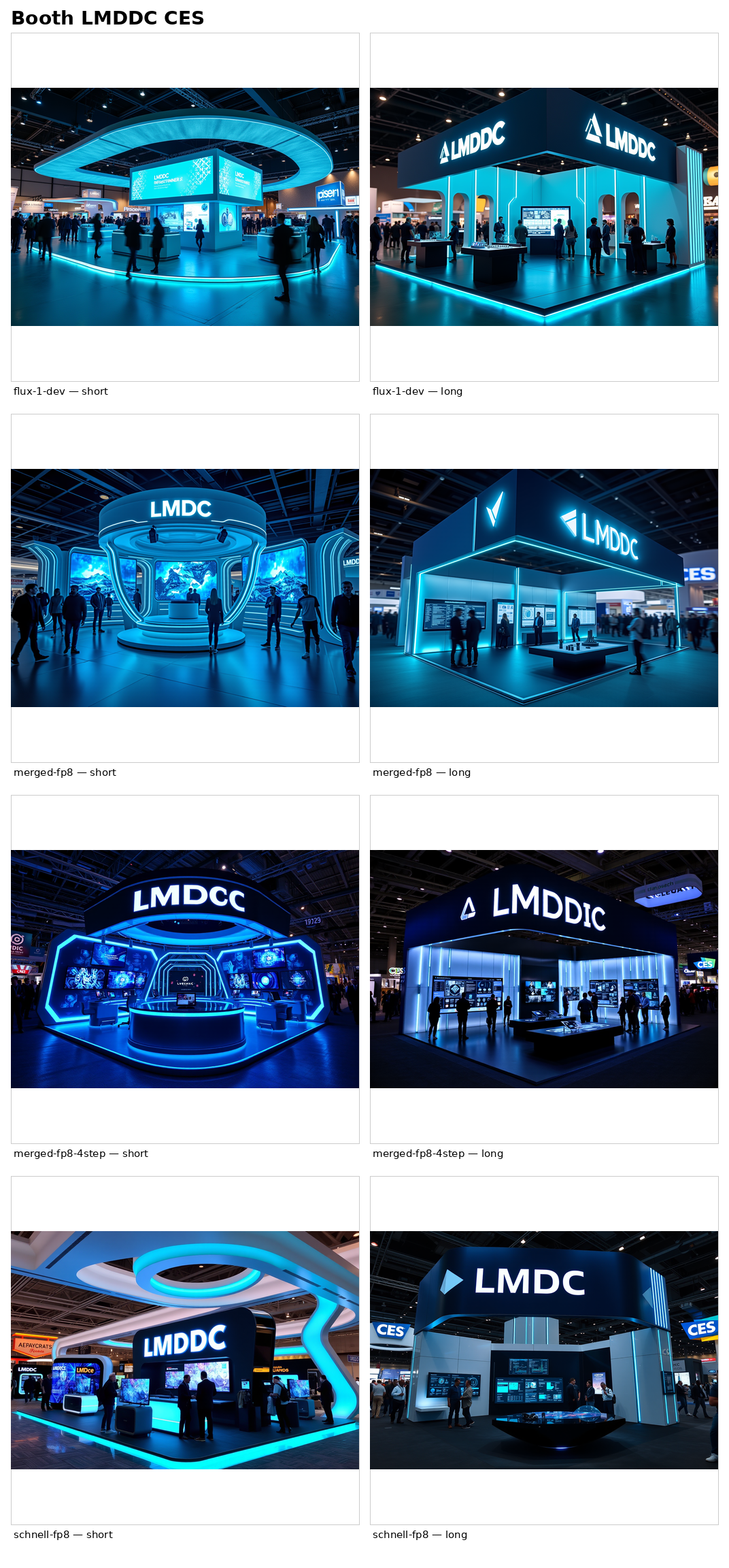
Overall rating: 2.5/5
Winner : flux-1-dev came out on top overall, followed by schnell with the short prompt (LMDDC is missing one letter in the image generated from the long prompt).
Third Trial: a film poster
The ultimate trial: a poster for an imaginary sequel to a classic French comedy, with the title "La cité de la peur 2" written in big letters, a subtitle and three characters. Poster layout + multi-word text in French + accents.
Short prompt:
Create a movie poster for "LA CITÉ DE LA PEUR 2", sequel tribute to the 1994 French cult comedy by Les Nuls, with the three protagonists 30 years later.
Long prompt:
Movie poster for a French comedy sequel titled "LA CITÉ DE LA PEUR 2", a direct visual homage to the iconic 1994 cult poster of the original film by Les Nuls. Composition: three protagonists side by side at the center of the poster, all in their late fifties (aged 30 years since the original). On the left: a thin man with glasses and dark hair holding up a small silver revolver next to his face, serious worried expression. In the middle: a curly brown-haired woman wearing a black vest over a polka-dot bowtie blouse, neutral confident look. On the right: a chubby cheerful man with short dark hair laughing wide-mouthed, white t-shirt. Above them, a horizontal banner in cream-white blocky outlined capital letters reading "LE FILM DE LES NULS 2". Below the protagonists, the title "LA CITÉ DE LA PEUR 2" in massive distressed bright yellow serif font with a subtle red drop shadow, slightly tilted diagonally. Just under the title, in italic cream-white serif: "Le grand retour". Background: dramatic stormy dark teal sky transitioning to a vibrant orange-red sunset over the bay of Cannes, with the city lights of the Croisette visible in the distance and the Palais des Festivals roof discernible. Vintage 1990s French comedy poster aesthetic, painted illustration style, slight paper texture and scan grain, full poster crop.
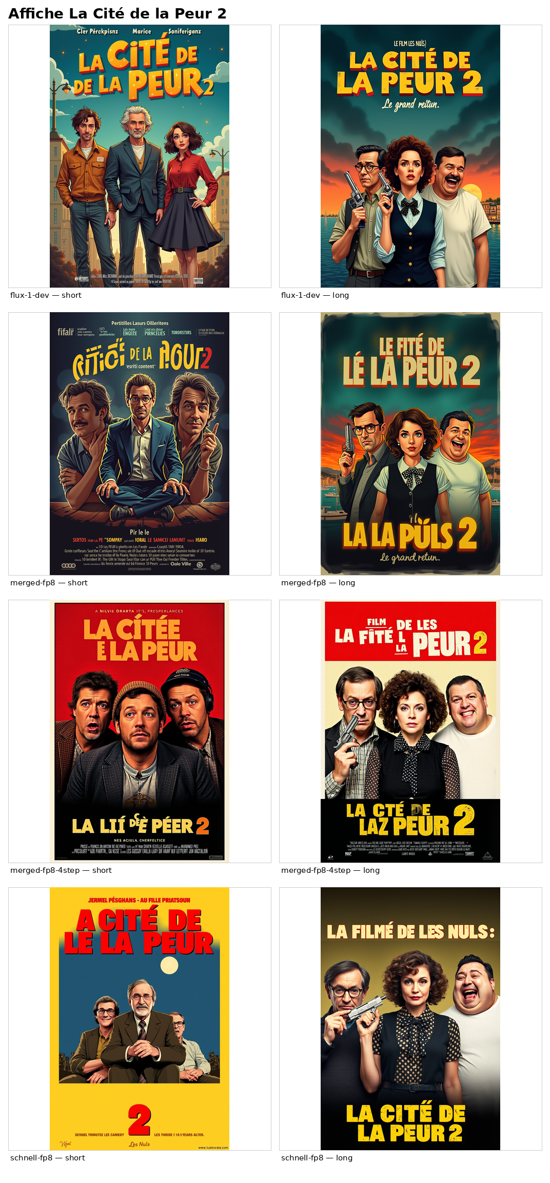
Overall rating: 2/5
Winner : flux-1-dev is far ahead of the others in terms of result quality and text fidelity. I want to point out that these are only image‑generation models, meaning they are not linked to "vision models". Consequently, they can only rely on the description provided in the prompt and on their training data to create these posters. I wasn’t able to “show” them the original poster so they could adapt it. However, I used a vision-based model so that it coul describe the original poster to me and suggest a long prompt.
Verdict
Flux-1-dev cleraly is the winner of this "battle". As the "largest" model tested here, we could almost have expected it. However, we can notice that quantized models, even with 4 steps, can still produce quite good results - given that we don't ask them to write text within the generated images (their biggest drawback).
Regarding the prompts, it depends on what you wish to achieve. When possible, it is often best, to let the LLM free to imagine the output and not to frame it too much with "over-engineering" prompts. Those can sometimes constrain the LLMs "too much" and overwhelm them with directives, at the risk of tehm missing some.
Julien Altmeyer